793682
| Question | Answer |
| BASIC SKILLS | ~draw sketches ~ Analise photos ~label and annotate ~use overlays ~literacy skills |
| INVESTIGATIVE SKILLS- fieldwork investigation~ aims, hypothesis, data to collect, methods, (river measurements), Collecting data for river surveys- SPEED- 10m length, time it takes the float to cover the distance, repeat several times, find average time (surface speed), x0.8 (true speed across channel), CROSS-SECTIONAL AREA & WETTED PERIMETER- run tape across river bank to bank, depth at 50cm intervals, transfer to graph, can get info from that, RIVER DISCHARGE- speed x cross-sectional area | |
| CARTOGRAPHIC SKILLS | -> the reading and interpretation of maps -> the production of maps in order to present information. read and interpret: atlas maps, OS maps, base maps&sketch maps, town-centre maps&plans |
|
Image:
sketch_map (image/jpg)
|
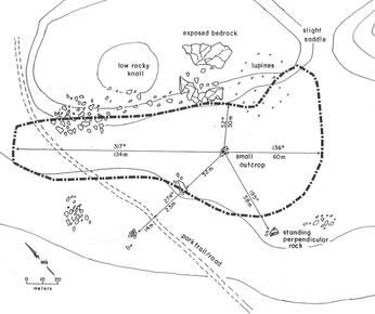
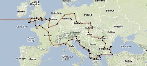
SKETCH MAP- illustrate location of case study, simple scale, + fit to your needs, easy to understand, - inaccuracies, lack of detail |
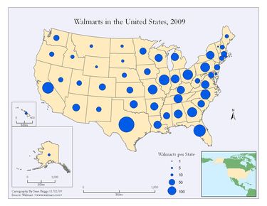
| PROPORTIONAL SYMBOL MAP- include symbols proportional in size/area to their value, + visual representation, clear, easy to understand - range rather than specific value, difficult to measure certain shapes | |
|
Image:
flow_line_map (image/jpg)
|
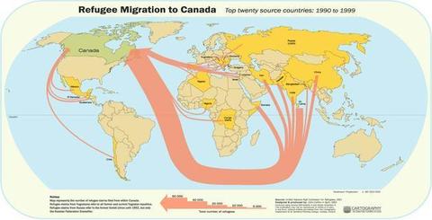
FLOW LINE MAP- represent volume of movement from place to place, line:quantity, along actual route, + clear visual representation - may look overcrowded if too many lines |
|
Image:
desire_line_map (image/png)
|
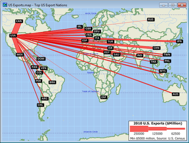
DESIRE LINE MAP- represent volume of movement from place to place, line:quantity, directly from origin to destination (no account of route), + clear visual representation - may look overcrowded if too many lines |
|
Image:
trip_line_map (image/jpg)
|
TRIP LINE- represent volume of movement from place to place, line:quantity, can be drawn to show regular trips (e.g. footfall of shoppers in town), + clear visual representation - may look overcrowded if too many lines |
|
Image:
choropleth_map (image/jpeg)
|
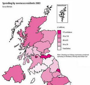
CHOROPLETH MAP- data values represented by density of shading, area in terms of value (e.g. pop density in UK), in classes, + colourful, draws attention, visual, - assumes whole area under one form of shading has same density with no variations, implies abrupt changes as you cross regional borders (not the case) |
|
Image:
isoline_maps (image/png)
|
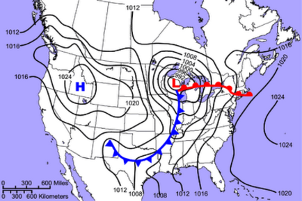
ISOLINE MAP- all points along a line have same value (e.g. pressure in weather and altitude on OS maps), + allows patterns of distribution to be seen (clear), - difficult to get continuous data along a line |
|
Image:
dot_map (image/jpg)
|
DOT MAP- spatial distribution represented by a number of dots equal to size (e.g. 1dot=10,000people), + clear, visual, - large numbers of dots are difficult to count, assumes false emptiness in areas below dot value, must be accompanying info about distribution or may be misleading |
| GRAPHICAL SKILLS | -> different types of representations of data (mainly graphs) |
| ARITHMETIC LINE GRAPHS- simple line graph- line represents actual values of measure on y axis | |
| ARITHMETIC LINE GRAPHS- compound line graph- differences between the points on adjacent lines give actual values, areas between lines usually shaded | |
| ARITHMETIC (LINE) GRAPHS- two sets of data- left hand y axis for one scale and right hand y axis for a different scale, + useful visual impression of the connection between two sets of data | |
| USING ARITHMETIC (LINE) GRAPHS | ~plot independent on x axis and dependent on y axis, avoid awkward scales, clearly label axes, use different colour/symbol if plotting more than one line |
| ARITHMETIC LINE GRAPHS- pros and cons | + can compare multiple continuous data sets easily, + data inbetween points can be inferred through line of best fit, + can make predictions, - can only use continuous data, - only used to show data over time |
| LONG SECTIONS & CROSS-SECTIONS- used in river studies, construct line graphs showing height (y axis) but with distance on the x axis, + useful for describing and comparing land shape, - difficult to select smaller scale without inaccuracies | |
| BAR GRAPHS- height is proportional to value, verticala scale is absolute data (discrete), can be SIMPLE, COMPARATIVE or COMPOUND, + show relative magnitudes effectively, +could show positive and negative values, + easy to understand, - categories can be re-ordered to emphasize certain effects (biased), -only discrete data | |
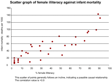
|
Image:
scattergraph.gif (image/gif)
|
SCATTERGRAPHS- investigate relationship between two sets of data, best-fit line can be added, bottom left to top right= positive correlation top left to bottom right= negative correlation, points away from trend line known as residuals (anomalies) + useful in identifying patterns that could lead to further inquiry, + outliers could be investigated, + shows trend, - correlation could emerge when a relationship is just coincidental- all data must be continuous, - hard to visualise results in large data sets |
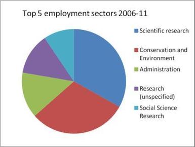
|
Image:
pie_chart (image/jpg)
|
PIE CHARTS- divided into segments according to share of total value, + visually effective, - difficult to assess percentages or make comparisons when many small segments, - needs a key, -no exact numerical data, -best for 3-7 categories, -total is unknown |
| PROPORTIONAL DIVIDED CIRCLES (lots of pie charts)- no. of pie charts drawn proportionally together... use formula r= √V/π, V= value you want total pie chart to represent, r= radius of pi chart, (π=3.142), draw a circle radius r on graph paper, must state scale area represents value x units of data= 1 square unit on the graph paper | |
|
Image:
triangular_graph (image/png)
|
TRIANGULAR GRAPH- plotted on special paper (equilateral triangle), + varying proportiong and their relative importance can be seen, + can see the dominant variable of the three, +clusters sometimes emerge allowing classification, - only possible to use it for a whole figure broken into three components as percentages, cannot be used for absolute data or for figures not broken down into three components |
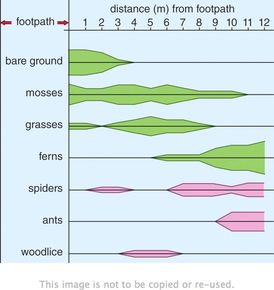
|
Image:
kite_diagram (image/jpg)
|
KITE DIAGRAMS- show changes over distance, particularly in vegetation, one axis is distance, the other the individual plant species, width of kite represents a single species, + width of kite enables visual comparisons to be made of the distribution of vegetation at any point in the section |
|
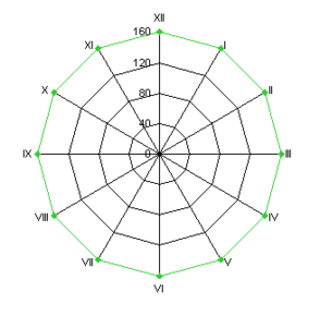
Image:
radial_diagram (image/png)
|
RADIAL DIAGRAMS- circumference represents orientations (compass directions) or a recurring feature e.g. a time period of 24 hours or an annual cycle of activity +can be used to plot traffic flows ore pedestrian flows over a period of time during the day, +can compare multiple sets of data, +useful when one variable is a directional feature, -hard to spot anomalies, -hard to make a suitable scale, |
| LOGARITHMIC GRAPHS- drawn in same way as arithmetic graphs but scales are divided into a no. of cycles, each representing a tenfold increase in the range of values i.e. 1 to 10 then 10 to 100 then 100 to 1000 etc., starting point depends on data range, graph paper can be fully logarithmic or semi-logarithmic (one axis on log scale and other is linear), straight line if rate of change increasing at constant proportional rate (e.g. doubling each time period), + good for showing rates of change (steeper line, faster rate), + allow a wide range of data to be displayed, -cannot plot +ve and -ve values on the same graph, -never base line of 0 | |
|
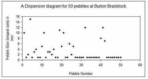
Image:
dispersion_graph (image/jpg)
|
DISPERSION GRAPHS- used to display the main patterns in data distribution, graph show each value as individual point against a vertical scale, shows range of data and distribution within the range +enables comparison of the degree of bunching of 2 sets of data, +shows spread from mean, +anomalies shown, -works better with lots of data, -standard deviation can be manipulated (biased) |
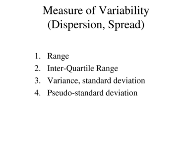
| STATISTICAL SKILLS | ->measures of central tendency (averages & distribution) -> measures of dispersion or variability -> box & whisker plots -> histograms ->correlation (Spearman rank correlation coefficient) |
| MEASURES OF CENTRAL TENDENCY- Arithmetic mean= (Σx)/n, Mode= most frequent value, median= (n+1)/2 (middle number), distribution of the data set= +ve or -ve skew (bigger difference in mean, mode, median -> bigger skew...+ve or -ve) | |
| MEASURES OF DISPERSION OR VARIABILITY- range= highest value- lowest value, inter-quartile range= Q3-Q1= [3(n+1)/4]-[(n+1)/4], Standard deviation= √[(∑x^2 )/n)-((∑x)/n)^2] | |
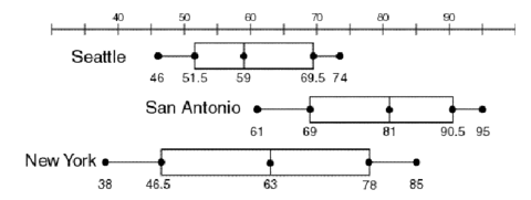
| BOX-AND-WHISKER PLOTS- need median, Q1, Q3, highest value, lowest value and outliers. The box contains 50% of the data and is the IQR | |
|
Image:
histogram (image/jpg)
|
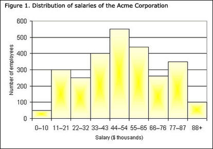
HISTOGRAMS- used to show frequency distribution of data, use bars for frequency, data is classed/grouped, +used to simplify and clarify data that are easier to analyse when in groups, +large amounts of data can be reduced to manageable proportions, +makes it possible to see trends, -dificult to group the data (establish no. of classes and class interval) |
|
Image:
spearman_s_rank (image/jpg)
|
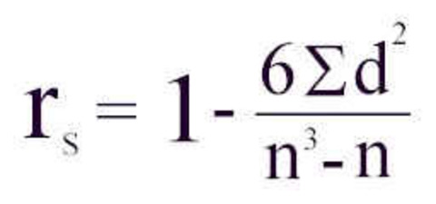
SPEARMAN RANK CORRELATION COEFFICIENT (measuring correlation)- comparison between two sets of data to see if there is a relationship between them, measures degree to which there is correlation, raw figures are ranked, d=difference in ranking between the two sets of paired data, n= no. of sets of paired data, Method~ 1. rank both sets highest to lowest (highest=1, 2nd highest=2 etc.)(if 2+ the same, find average rank and the next value will be the one after), 2. calculate difference in rank for each set of paired data (d), 3. put d and n in formula, 4. 1=perfecet +ve correlation, -1= perfect -ve correlation, 0= no correlation |
|
Image:
spearman_s_rank (image/jpg)
|
SPEARMAN'S RANK CONTINUED- warnings~ need between 10 and 30 data sets since unreliable if lower and too complex if higher, relationship may have occurred by chance->must assess statistical SIGNIFICANCE through tables- >5%=insignificant, <5%=significant=meaningful, <1% occurring by chance= very significant, if coefficient>table value ~ significant at that level |
|
Image:
ICT_skills_geog (image/jpg)
|
ICT SKILLS- ~use remotely sensed data (photos including satellite), ~use databases (e.g. censuses), ~use Geographical information systems (GIS), ~present text, graphical and cartographic images using ICT |
|
Image:
GIS (image/jpg)
|
GIS (a mapping tool)- used by environmental planners, gov. departments, public utility companies & commercial companies. Ability to store, retrieve, manipulate & analyse wide range of spatially related data. Can: help with ?ing and understanding data, enable multiple interrogation of complex data, illustrate difficult concepts in dynamic & visual way, use 3D, help for modelling and decision making |
Want to create your own Flashcards for free with GoConqr? Learn more.